http://www.sportslogos.net/Site/article.php?n=4928
I'm a big uniform nut...I'm interested in seeing what they'll do the logo and the jerseys. Ducks isn't an awful name but the whole Mighty Ducks thing was pretty lame. Good move by the team to change the name.
The Anaheim Ducks in 2007
Moderator: Shoalzie
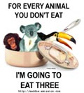
They should change the name entirely. "Ducks" is a stupid name. Most team names conjure up images of fearsome beasts, majestic birds or regional characteristics. A duck is not fearsome or majestic. It is a swimming fowl that can't fly worth a fuck, eats ponds scum, and is best observed from the trigger end of a 12 gauge shotgun. Most of the ducks around here just harass people for handouts of bread instead going out and finding their own fucking meal. Better yet, let's get rid of the Duck franchise altogether. Fuck the Ducks!
Tiger Williams wrote:"... some snot-nosed little fuck that isn't going to break a nail is going to score 50 goals and he's never driven to the net in his life. He's never stood in front with Moose Dupont giving him 89 cross checks in the back of the head."
-
Cross Traffic

- Eternal Scobode
- Posts: 2040
- Joined: Sun Jan 16, 2005 8:55 am
- Location: Boise, ID
-
Screw_Michigan
-
MgoBlue-LightSpecial
- Eternal Scobode
- Posts: 21259
- Joined: Wed Jan 19, 2005 2:35 pm


-
Cross Traffic
- Eternal Scobode
- Posts: 2040
- Joined: Sun Jan 16, 2005 8:55 am
- Location: Boise, ID
-
Funkywhiteboy

- Wiseass
- Posts: 1667
- Joined: Sat Jan 15, 2005 3:41 pm
- Location: Palmyra, PA
Try saying that ten times real fast!Mainiac wrote:Fuck the Ducks!
“If you look at folks of color, even women, they’re more
successful in the Democratic Party than they are in the white, uh,
excuse me, in the Republican Party.” (NPR Interview Of Howard Dean
<http://www.breitbart.tv/html/153493.html> , 8/15/08)
successful in the Democratic Party than they are in the white, uh,
excuse me, in the Republican Party.” (NPR Interview Of Howard Dean
<http://www.breitbart.tv/html/153493.html> , 8/15/08)
-
See You Next Wednesday

- De Gustibus Non Est Disputandum
- Posts: 1487
- Joined: Sat Jan 15, 2005 9:34 pm
LinkShoalzie wrote:al? wrote:This.....
also sucks.
NHL marketing genius' strike again.
What's wrong with that? I did like the old logo too but it's nothing to complain about. If they attach a corporate name to the Stanley Cup, now that would be something to be up in arms over.
"As democracy is perfected, the office of president represents, more and more closely, the inner soul of the people. On some great and glorious day the plain folks of the land will reach their heart's desire at last and the White House will be adorned by a downright moron."
- H.L. Mencken (1880 - 1956)
- H.L. Mencken (1880 - 1956)
A preview of the Ducks new look...
http://www.anaheimducks.com/team/players.php
I like seeing a different color combination. Gold, orange, and black is unique, I'll give them that. I'll bet we'll see what the new jersey looks like on draft day when they hand that out to their first round pick.
The old Mighty Ducks site has a countdown to the official change-over...by around 2 p.m. the Mighty Ducks will be no more.
-
MuchoBulls
- Tremendous Slouch
- Posts: 5626
- Joined: Sat Jan 15, 2005 9:00 pm
- Location: Wesley Chapel, FL

-
The Rat Pack

- live at The Sands
- Posts: 349
- Joined: Thu Oct 06, 2005 12:49 am
I have nothing against the Ducks, but that jersey is terrible. It looks like some high school piece of crap that gets passed down over the years.
The colors are OK. Webbed feet? Oh..that explains it. I thought it was some reject from Batman Returns.
The colors are OK. Webbed feet? Oh..that explains it. I thought it was some reject from Batman Returns.
Pierre McGuire: "The Washington Capitals are the sleeping giants of the East. Exciting times in Washington are coming."


-
MuchoBulls
- Tremendous Slouch
- Posts: 5626
- Joined: Sat Jan 15, 2005 9:00 pm
- Location: Wesley Chapel, FL
-
Cross Traffic
- Eternal Scobode
- Posts: 2040
- Joined: Sun Jan 16, 2005 8:55 am
- Location: Boise, ID